June 14, 2013No Comments

Upgrade Soul


Without a great story, every new technology or new form of interaction is meaningless. I can't remember where I read that but it's hard to argue against it.

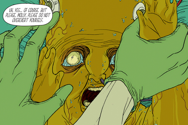
Upgrade Soul is an app, an immersive science fiction graphic novel. I won't go deeper into its story, instead will tell you that it's beautifully executed, the use of today's available technology enhances the artwork and story.

Personally, I'm a fan of this illustration style. The color palatte, detailed line work and characters coupled with the use of Opertoonity (a spin-off of the Unity game engine) and the musical score have a great effect on the experience and narrative as you swipe through panels.

The science fiction story is both interesting and intriguing. The art in this app looks great on both the Retina iPad and the iPad mini, and it scales well on both devices. Controls allow you to swipe left and up to advance the story and tilt your iPad for 3-D effects. When you move the iPad back and forth, the different objects in the scene will move for an extra air of realism.

Upgrade Soul was written and illustrated by Ezra Claytan Daniels, the original score was done by Alexis Gideon and the interactive design by Erik Loyer.

I was fortunate to have worked with Erik at one point while at Razorfish. You should check out his other projects like Chroma, an award-winning interactive serial in which users interact with fluid, real-time graphics. Also Strange Rain, an app that turns your device into a skylight on a rainy day. Raindrops fall and splatter on your screen, shifting perspective in 3D as you tilt your device like a handheld camera.

January 11, 2013No Comments

Design où es-tu?

I was finally able to visit "Design, where are you?" at the Cité des sciences et de l'industrie. An exhibition for both professionals and the general public, for users which we all are. It's an exhibition which questions design and looks beyond the "outer skin" of projects to better understand what design can achieve in companies, communities, in our daily lives.


P1050640-sm"Design, where are you?" is presented by the APCI: Agency for the Promotion of Industrial Creation. It helps businesses define an innovation strategy, advises public bodies, promotes French innovation and design internationally, highlights and supports design professionals.

I will spare you the academic bla-blah-blah, which the exhibition's literature contains a lot of. Nor will I mention all of the projects, for the complete list you should visit the Cité des sciences et de l'industrie website. What I will mention are my 4 favorite projects: MyTripSet, the Horologe Énergétique Enterprise, The Osmose Bus Station , and the new Girouette Parisian typeface for the city's bus system.

I enjoyed the exhibition, I found the majority of the projects very interesting and learnt a lot about the design industry here in Paris, and in France in general. What I didn't enjoy was the exhibition signage, the project's descriptions were too long, you are forced to read too much about the philosophy and theory before getting to the basic information: what and how. I have nothing against hypothesis and ideology but give me the basic stuff first, I'll happily read the rest if I'm truly interested. Also, the exhibition's layout is not clear, I was not sure if I was still in "Design, where are you?" or if I had walked into the adjacent exhibition. Then again, perhaps this is the museum's strategy?

Following are descriptions of my 4 favorite projects (edited from the exhibition's website).


[sr-subtitle size="h4" alignment="auto"]1 - Mytripset[/sr-subtitle]

Client: SNCF
Design: Attoma

MyTripSet-LG


Winner of a European award, MyTripSet lets you organize your journey throughout Europe. This travel aid establishes your circuit a la carte on a touch tablet, computer or smartphone. Flights, trains, hotels, museums… MyTripSet breaks down borders.

The interaction design and digital architecture bring meaning to the jungle of existing networks. By focusing on the needs of travelers, they have come up with an intuitive interface and intelligent services which make a complex information network accessible.

The Attoma agency, which has expertise in service design and the UX, developed the functionality and interface of MyTripSet from a base of common needs and behaviors of 4 major traveller families. Comparing transport modes, choosing your journey according to duration, its cost or carbon footprint, buying your tickets, MyTripSet takes care of everything.


[sr-subtitle size="h4" alignment="auto"]2 - Horologe Énergétique Enterprise[/sr-subtitle]

Client: EDF
Design: EDF R&D and In-flexions


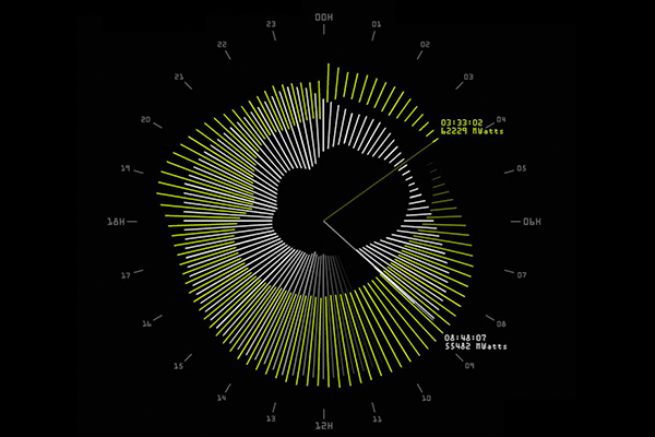
Raising awareness. How can employees be made aware of the need for energy savings? As a pioneer in the matter, EDF (Electricity of France) is making information clearer thanks to the Horologe Énergétique. Attractive and easy to understand, it shows consumption and savings caused by daily actions such as turning off your PC during lunch.

Real time. Installed in regularly frequented zones, the clock offers an accessible display of the time, date, block calendar and internal communications, but also the building's real time energy consumption. Daily and weekly evaluations and consumption targets can be easily interpreted thanks to the interface's intuitive design.

Corporate social responsibility. Driven by in-house design, the EDF team worked with In-flexions, an agency specialized in digital design. At the intersection of a range of expertise (instrumentation and measurements, economics, sociology and behavioral sciences, information system, web, marketing), the design brought employees together around a societal challenge.


[sr-subtitle size="h4" alignment="auto"]3 - Osmose Bus Station[/sr-subtitle]

Client: RATP
Design: RATP and Marc Aurel


Waiting for the bus of the future. The RATP (Public Transport Authority of Paris) called on the Marc Aurel agency to come up with a new generation station. An interface between the city and the street, the bus station can also serve as a community space. The proof comes with Osmose, an experimental station at the Gare de Lyon in Paris.

The designer focused on well being, in keeping with his humanist principles, choosing to create a blend of technologies and services with a touch of poetry. Vast and extensively covered with its heated walls and ceramic seats, the Osmose station is high on the comfort factor. With wi-fi and touch screens it also serves as an online facility. A coffee kiosk, library, electric bikes, everything is user-oriented. A luminous atmosphere with musical walls, Guimard aesthetics, it is remarkably harmonious.


[sr-subtitle size="h4" alignment="auto"]4 - Girouette Parisian typeface[/sr-subtitle]

Client: RATP
Design: Jean-François Porchez


Creation of three Parisian typefaces for LED electronic bus display screens owned by the RATP.

Since 2009, the 350 buses brought into service by the RATP every year have been equipped with LED signage indicating the number of the bus and the destination. Yet the Parisian typeface adopted by the RATP dates back to 1992; it was therefore time to upgrade the typefaces for information display on buses so as to offer users clearer indication of the service.

The typographer Jean-François Porchez, who originally created the Parisian, developed variants on his typography more suited to the shorter format of LED panels. He also had to factor in constraints related to urban use and outline characters legible by all passengers including the sight impaired.

November 12, 2012No Comments

What is Football

Today I was given a challenge: spend a couple of hours putting together a presentation that explains what Football is to somebody who doesn't know the sport. The following is a rough draft, the result of some loose playfulness.

Unfortunately for me, having football knowledge doesn't make one a good player. Perhaps one day I can become a football TV commentator instead.


Footbal-presentation-01
Footbal-presentation-02
Footbal-presentation-03

Footbal-presentation-04
Footbal-presentation-05


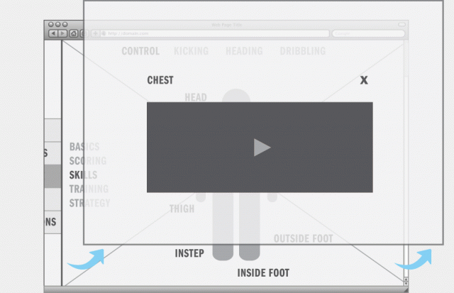
Following is a quick visual design mockup of the interaction for CONTROL. How to control the ball using body parts allowed by the rules.


Above all, football is a game. If I were to dedicate the necessary time to this project, I would want the final design to be more refined, bold and colorful, friendly and inviting to use. The experience should be playful and convivial, but elegant. Imagine smooth movements and transitions.

In the above interaction example, the main goal is for the user to explore the six methods to control the ball. I would choose a simple and bold representation of a player, I would want the figure to be imposing with a low viewer eye-level. Thus, helping create an immersive experience.

That's all for now but I hope to be able to revisit this project in the near future.

October 6, 2012No Comments

Nuit Blanche 2012

P1050559sm


This year, my first Nuit Blanche in Paris, was an uneventful evening. It probably doesn't deserve this post or my time spent on this brief article.

For starters, I don't remember the reason why but I was already exhausted before the evening started. Perhaps because there was a friend in town and we had been staying out late every night prior? Nonetheless, I was determined to go out and at least see one or two exhibitions. I was looking forward to visiting La Gaît Lyrique and the Palais de Tokyo. Unfortunately we could not visit either, the lines to get in were incredibly long and to top it off it began to rain early in the evening. I'm sure the weather prevented a lot of people from coming out, I wonder how much worse the lines would have been without the rain.

Lessons learned for next year: I'll make sure to get plenty of sleep the night before, either show up to the venues really early or really late in order to avoid the long lines. Also, don't forget your scotch-filled flask.


P1050562sm

June 1, 2012No Comments

El Globalito

El-Globalito-2bAiming to be the number one authority of Latin American culture in Paris. El Globalito is an interactive guide, a source for the latest in arts, gastronomy, travel and special events.

Not limited to Paris-based affairs, El Globalito will also include curated reporting and criticism on stories based in Latin American. Via a network of contacts throughout Central and South America, we will bring current and historical events relating to wide-range subjects such as music, politics, food, sports, arts, the environment, the bizarre and ludicrous. In short, whatever we consider interesting and find worthwhile reporting.

El Globalito will thus become the base for the Parisian public to find out about, not only Latin American events in their own backyard, it will also provide a peek into the state of affairs throughout the Latin American continent.

Why do this? Well, El Globalito is self-initiated, a labor of love that had its conception when I knew I'd be relocating to Paris. It's a selfish project, the type of work that satisfies a personal longing which is to collaborate more closely with Latin America. At the same time, providing valuable information to Parisians interested in the Latin culture.

I've always been a big fan of publications such as LA Weekly, Village Voice and other similar print magazines. Whether you agree with their opinions or not, they always provide a reliable, clear and personal point of view on different topics. To me this has always been refreshing. While living in Los Angeles and New York, I always looked forward to picking up the latest edition (usually on Thursdays) and reading their articles during my lunch hour. Besides the generic restaurant and concert guides, I've always enjoyed reading stories main stream newspapers don't find worthwhile covering and skip altogether.

El Globalito will contain a percentage of this type of content (local and international), combined with a calendar of art, music, gastronomy, travel and special events.


El-Globalito-3


I've had the chance to, during the past three-four years, travel to different countries throughout Central and South America on a regular basis. Allowing me to not only reconnect with family, friends and acquaintances, but also to meet new individuals who are, in their own way and to their own degree, participating in creating a new and vibrant Latin America.

For me, someone who left this part of the world at an early age and has not had much contact until now, besides the yearly family gatherings, the past few years have been a sort of awakening. A confirmation of a basic need to be involved and rebuild bridges with the past and make Latin America a big part of my future.

This personal need and my relocation to Paris, as well as the interest of Parisians to find out more about the Latin American culture, gave me the idea to start El Globalise.


El-Globalito-8


The above mood-board and below wireframes are all I can share with you at the moment. I'm sure the move and adaptation to Parisian life will take up most of my time in the near future. But stay tuned, I will definitely share more updates as soon as I can.


El-Globalito-7a