October 9, 2017No Comments

France is AI

[spacer size="small"]

I was fortunate to stumble upon the France is AI event this past week. As much as I dislike the name of the conference - I mean really, we cannot always directly translate phrases from one language to another without ensuring the result has the same impact as in he original language. Or perhaps it’s me who doesn’t get the clever play on words and charming double meaning?

The mission of France is AI is to support and promote the French Artificial Intelligence ecosystem while building bridges with the other AI hubs, locally and internationally. It was the conference’s second edition, two days of roundtables, talks, and startup competition with researchers, entrepreneurs, executives and VCs.

Overall, the event was very interesting and sometimes insightful. As someone who works on the creative (not technical) side of the industry, it helped me discover and understand some of the processes used by engineers and data experts. Vocabulary is key, and some of the meanings attached to simple words like “features” are not always the same from one field to another.

In machine learning and pattern recognition, a feature is an individual measurable property or characteristic of a phenomenon being observed. Choosing informative, discriminating and independent features is a crucial step for effective algorithms in pattern recognition, classification and regression.

[spacer size="small"]

FranceIsAI-02

[spacer size="small"]

There were speakers from various companies and organizations, the usual suspects such as Microsoft, Facebook, Walmart, Twitter, Criteo, Huawei, SNCF, etc. As well as educational institutions such as ENS, INRIA, Rouen University, UPMC.

For me, the most interesting discovery was that of Women in AI (fortunate not to be named “Women are AI”), as per their website: “We are a group of passionate international women who are experts and self-trained in the field of Artificial Intelligence. We felt the lack of diversity of women in this field and we want to change it.” Moon Asghari represented the community and gave an interesting talk about their support in closing the gender gap, education, research and studies.

I'm looking forward to next year's edition. Hopefully France will still be AI.

June 14, 2013No Comments

Upgrade Soul


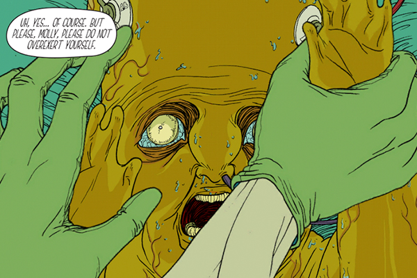
Without a great story, every new technology or new form of interaction is meaningless. I can't remember where I read that but it's hard to argue against it.

Upgrade Soul is an app, an immersive science fiction graphic novel. I won't go deeper into its story, instead will tell you that it's beautifully executed, the use of today's available technology enhances the artwork and story.

Personally, I'm a fan of this illustration style. The color palatte, detailed line work and characters coupled with the use of Opertoonity (a spin-off of the Unity game engine) and the musical score have a great effect on the experience and narrative as you swipe through panels.

The science fiction story is both interesting and intriguing. The art in this app looks great on both the Retina iPad and the iPad mini, and it scales well on both devices. Controls allow you to swipe left and up to advance the story and tilt your iPad for 3-D effects. When you move the iPad back and forth, the different objects in the scene will move for an extra air of realism.

Upgrade Soul was written and illustrated by Ezra Claytan Daniels, the original score was done by Alexis Gideon and the interactive design by Erik Loyer.

I was fortunate to have worked with Erik at one point while at Razorfish. You should check out his other projects like Chroma, an award-winning interactive serial in which users interact with fluid, real-time graphics. Also Strange Rain, an app that turns your device into a skylight on a rainy day. Raindrops fall and splatter on your screen, shifting perspective in 3D as you tilt your device like a handheld camera.

January 11, 2013No Comments

Design où es-tu?

I was finally able to visit "Design, where are you?" at the Cité des sciences et de l'industrie. An exhibition for both professionals and the general public, for users which we all are. It's an exhibition which questions design and looks beyond the "outer skin" of projects to better understand what design can achieve in companies, communities, in our daily lives.


P1050640-sm"Design, where are you?" is presented by the APCI: Agency for the Promotion of Industrial Creation. It helps businesses define an innovation strategy, advises public bodies, promotes French innovation and design internationally, highlights and supports design professionals.

I will spare you the academic bla-blah-blah, which the exhibition's literature contains a lot of. Nor will I mention all of the projects, for the complete list you should visit the Cité des sciences et de l'industrie website. What I will mention are my 4 favorite projects: MyTripSet, the Horologe Énergétique Enterprise, The Osmose Bus Station , and the new Girouette Parisian typeface for the city's bus system.

I enjoyed the exhibition, I found the majority of the projects very interesting and learnt a lot about the design industry here in Paris, and in France in general. What I didn't enjoy was the exhibition signage, the project's descriptions were too long, you are forced to read too much about the philosophy and theory before getting to the basic information: what and how. I have nothing against hypothesis and ideology but give me the basic stuff first, I'll happily read the rest if I'm truly interested. Also, the exhibition's layout is not clear, I was not sure if I was still in "Design, where are you?" or if I had walked into the adjacent exhibition. Then again, perhaps this is the museum's strategy?

Following are descriptions of my 4 favorite projects (edited from the exhibition's website).


[sr-subtitle size="h4" alignment="auto"]1 - Mytripset[/sr-subtitle]

Client: SNCF
Design: Attoma

MyTripSet-LG


Winner of a European award, MyTripSet lets you organize your journey throughout Europe. This travel aid establishes your circuit a la carte on a touch tablet, computer or smartphone. Flights, trains, hotels, museums… MyTripSet breaks down borders.

The interaction design and digital architecture bring meaning to the jungle of existing networks. By focusing on the needs of travelers, they have come up with an intuitive interface and intelligent services which make a complex information network accessible.

The Attoma agency, which has expertise in service design and the UX, developed the functionality and interface of MyTripSet from a base of common needs and behaviors of 4 major traveller families. Comparing transport modes, choosing your journey according to duration, its cost or carbon footprint, buying your tickets, MyTripSet takes care of everything.


[sr-subtitle size="h4" alignment="auto"]2 - Horologe Énergétique Enterprise[/sr-subtitle]

Client: EDF
Design: EDF R&D and In-flexions


Raising awareness. How can employees be made aware of the need for energy savings? As a pioneer in the matter, EDF (Electricity of France) is making information clearer thanks to the Horologe Énergétique. Attractive and easy to understand, it shows consumption and savings caused by daily actions such as turning off your PC during lunch.

Real time. Installed in regularly frequented zones, the clock offers an accessible display of the time, date, block calendar and internal communications, but also the building's real time energy consumption. Daily and weekly evaluations and consumption targets can be easily interpreted thanks to the interface's intuitive design.

Corporate social responsibility. Driven by in-house design, the EDF team worked with In-flexions, an agency specialized in digital design. At the intersection of a range of expertise (instrumentation and measurements, economics, sociology and behavioral sciences, information system, web, marketing), the design brought employees together around a societal challenge.


[sr-subtitle size="h4" alignment="auto"]3 - Osmose Bus Station[/sr-subtitle]

Client: RATP
Design: RATP and Marc Aurel


Waiting for the bus of the future. The RATP (Public Transport Authority of Paris) called on the Marc Aurel agency to come up with a new generation station. An interface between the city and the street, the bus station can also serve as a community space. The proof comes with Osmose, an experimental station at the Gare de Lyon in Paris.

The designer focused on well being, in keeping with his humanist principles, choosing to create a blend of technologies and services with a touch of poetry. Vast and extensively covered with its heated walls and ceramic seats, the Osmose station is high on the comfort factor. With wi-fi and touch screens it also serves as an online facility. A coffee kiosk, library, electric bikes, everything is user-oriented. A luminous atmosphere with musical walls, Guimard aesthetics, it is remarkably harmonious.


[sr-subtitle size="h4" alignment="auto"]4 - Girouette Parisian typeface[/sr-subtitle]

Client: RATP
Design: Jean-François Porchez


Creation of three Parisian typefaces for LED electronic bus display screens owned by the RATP.

Since 2009, the 350 buses brought into service by the RATP every year have been equipped with LED signage indicating the number of the bus and the destination. Yet the Parisian typeface adopted by the RATP dates back to 1992; it was therefore time to upgrade the typefaces for information display on buses so as to offer users clearer indication of the service.

The typographer Jean-François Porchez, who originally created the Parisian, developed variants on his typography more suited to the shorter format of LED panels. He also had to factor in constraints related to urban use and outline characters legible by all passengers including the sight impaired.